Kubernetes Dashboard
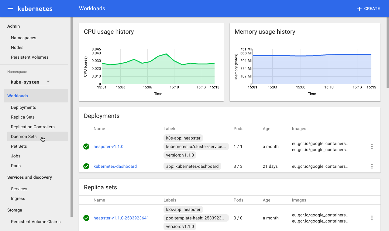
One of Dashboard's key advantages over a CLI is the ability to visualize monitoring and health checks
Editing a Deployment object type using Dashboard
Overview
Part of my work at Apprenda includes contributing toward the open source Dashboard, the official web UI for the container orchestration system Kubernetes. I work on Apprenda + Kubernetes integration efforts, as well as upstream contributions to Github, and I am currently lead UX designer on Dashboard and co-lead of its special interest group. Serving as project manager, researcher, UX designer, and visual designer in an open source context for the first time has been challenging, but the community has been incredibly supportive. Based on my ramp-up experience on the project, I put together a guide for other designers to walk them through step-by-step how to get involved.
Responsibilities
- Information architecture
- Persona generation
- UX design
- Visual design
- Prototyping
- Product Management
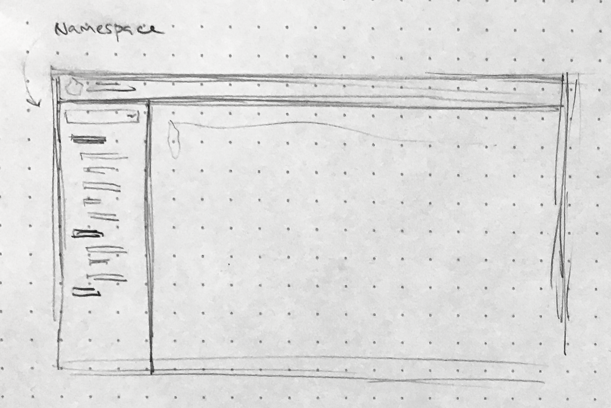
Project 1: Navigation
IA diagram exploring navigation hierarchy configurations
When I started contributing in summer ‘16, Dashboard had existed for a few months but still had no navigation: all its objects were just displayed in a single-page list. This was the highest-priority design need, so I plunged in headlong and strategized to pursue two tandem threads, 1) Learning fundamental low-level Kubernetes concepts, and 2) Keeping a 30,000’ view of why this whole product exists. Just because navigation was an obvious and acute need, I was careful not to make the mistake of assuming any ol’ solution would do. Navigation has cascading effects across the whole product, so it required extensive research and engagement of stakeholders from day one. Because Kubernetes has a largely flat information architecture (by design), we needed to carefully balance that lack of hierarchy with some level of structure. Focusing on key use cases helped the team prioritize one nav variant over another. For example: An operator gets a notification that one of their developer’s apps is down, so she heads to Dashboard to troubleshoot and sees error messages surfaced on the landing page. She then has to check logs and navigate to various related Kubernetes resources to diagnose the problem. In that scenario, two things are key: 1) Intuitive linking between related objects, and 2) A global nav that reinforces one’s position in the information architecture. This type of user story helped us identify important patterns to include, like the breadcrumb and a permanently-expanded list of secondary nav items under each primary item.
I wrote a blog post on the new navigation and the other features of the 1.4 release of Dashboard, and it ended up being one of the top-three most popular posts of 2016 for the Kubernetes blog.
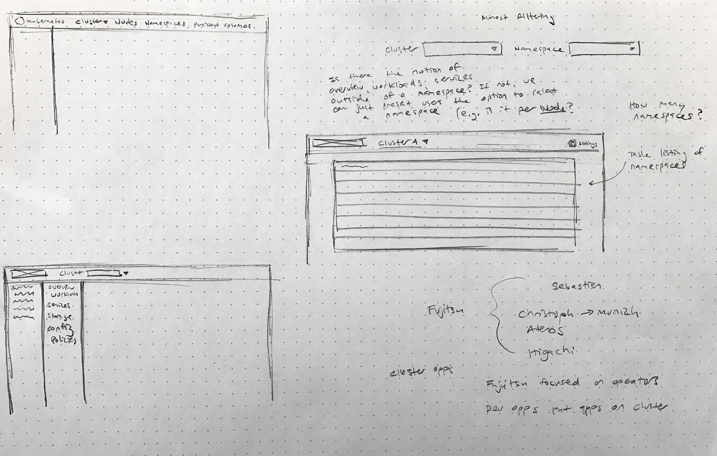
A selection of nav options considered
Material Design
Collaboration with Google Cloud Platform designers using InVision
Dashboard is based on Material Design, so upon starting on the project I had to go from a casual appreciator of Material to someone intimately acquainted with the system. Because Material is mobile-first and focused on consumer applications, we need to adapt its spec to suit Dashboard’s world of enterprise developers and IT. Google Cloud Platform designers have been instrumental in helping me make these tweaks, since they deal in a similar problem space and must factor in many of the same constraints (e.g. high information density).
While not bound to any standard of Material alignment, Dashboard does try to be generally consistent, so when working on Dashboard I have a set of browser windows open to various Google web products so I can reference how they’ve approached similar UI problems.
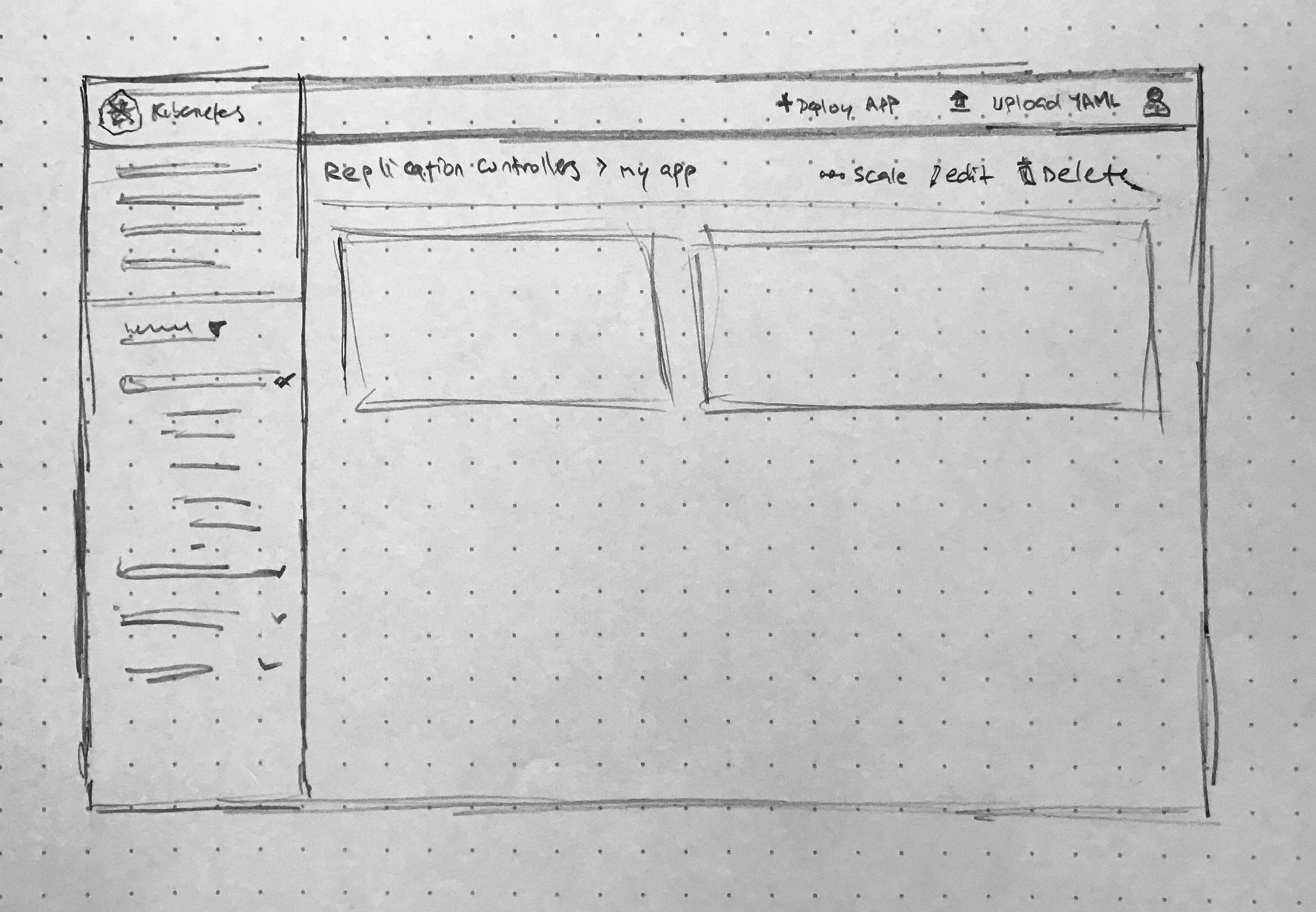
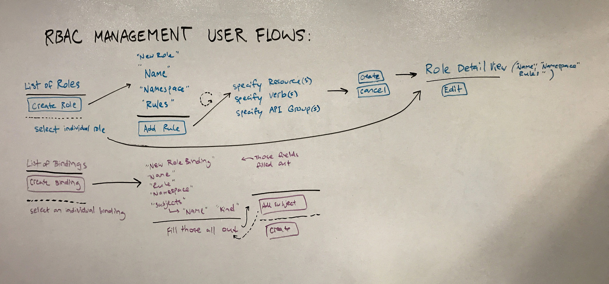
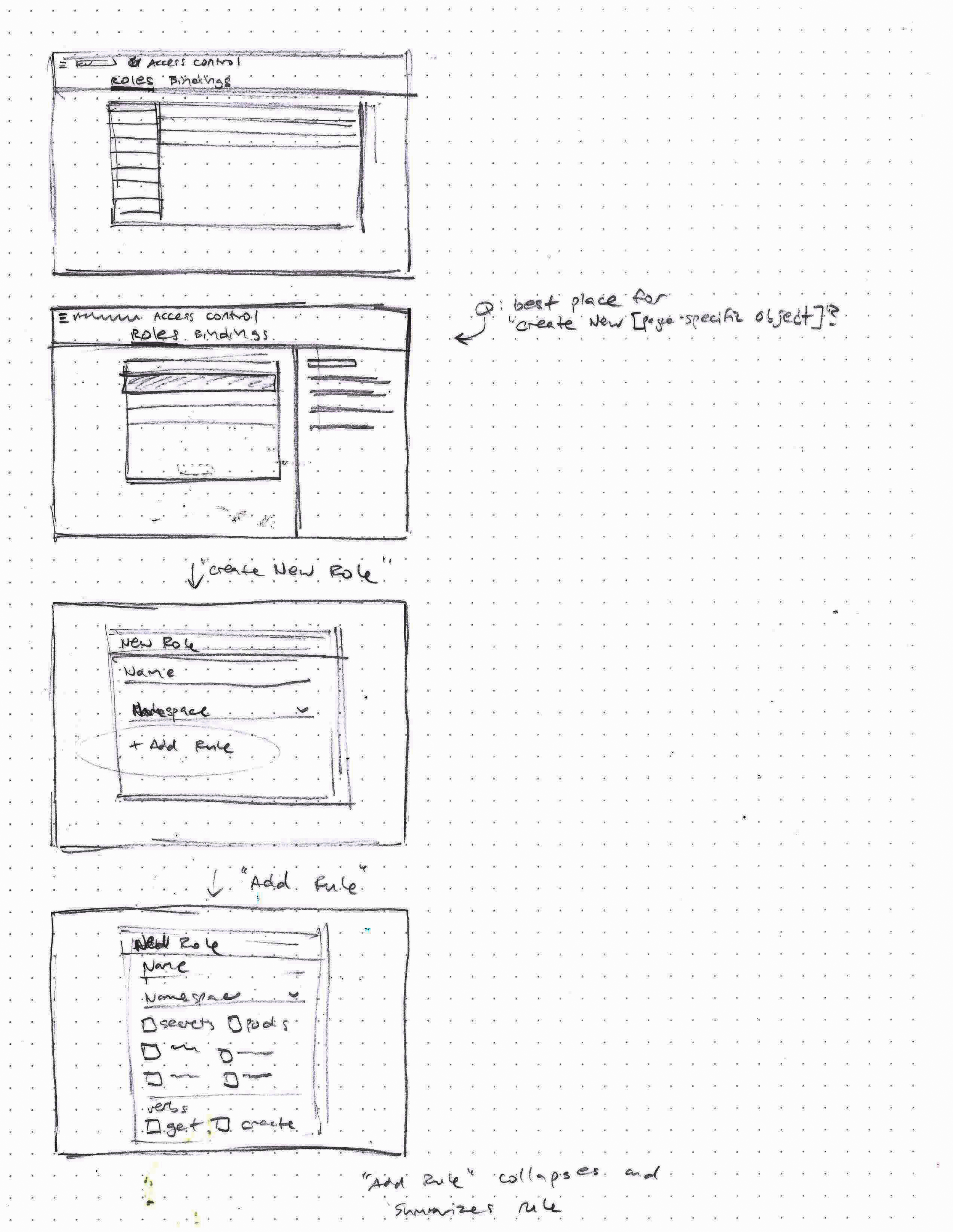
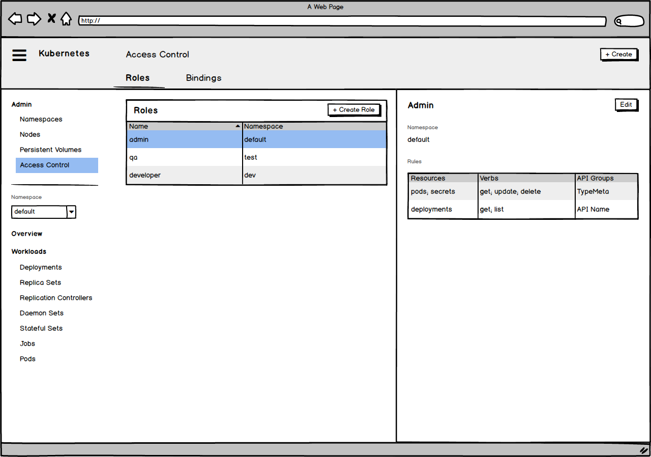
Project 2: Role Based Access Control Management
Role Based Access Control management was a feature in alpha in the main Kubernetes project that hadn't made it into the UI. The team saw value incorporating it, for its importance to Kubernetes users by letting them secure their clusters using permissions. The complexity and level of nested / interrelated objects of this feature necessitated the introduction of two UI patterns not previously a part of Dashboard: tabs, and a master-detail featuring a panel sliding out from the right side of the screen. For more info on RBAC, click through an interactive InVision prototype, or check out my design process writeup in which I reference it as a case study.
Project 3: User Research
My talk at KubeCon / CloudNative Con Seattle
Over 1000 people attended KubeCon / CloudNative Con Seattle 2016, and I had the opportunity to speak to a roomful of them about the work I’d been doing on Dashboard and solicit feedback. My co-presenter Piotr Bryk and I created a survey to send out to attendees, and based on those responses I designed this infographic and wrote an accompanying blog post for blog.kubernetes.io
Proposing user types on Github for community input

Infographic of survey results