Apprenda Portals
Apprenda 'Systems Operations Center'
Overview
Apprenda is a cloud platform company serving enterprise clients such as JP Morgan Chase, Boeing, and McKesson, and their UX team consists of yours truly. I started at Apprenda in January of 2016, and since that time have focused my efforts on UX solutions for our internal products – primarily our web ‘portals’ which are one of the means by which developers and IT operators can interact with our platform. Because of the highly technical nature of our offerings, a lot of my time is spent researching related technologies (e.g. Continuous Integration / Continuous Deployment) and then applying those learnings to align our UX more closely with the needs of our users.
Responsibilities
- Information architecture
- UX design
- Interaction Design
- Visual design
- Prototyping
- User Research
- Product Management
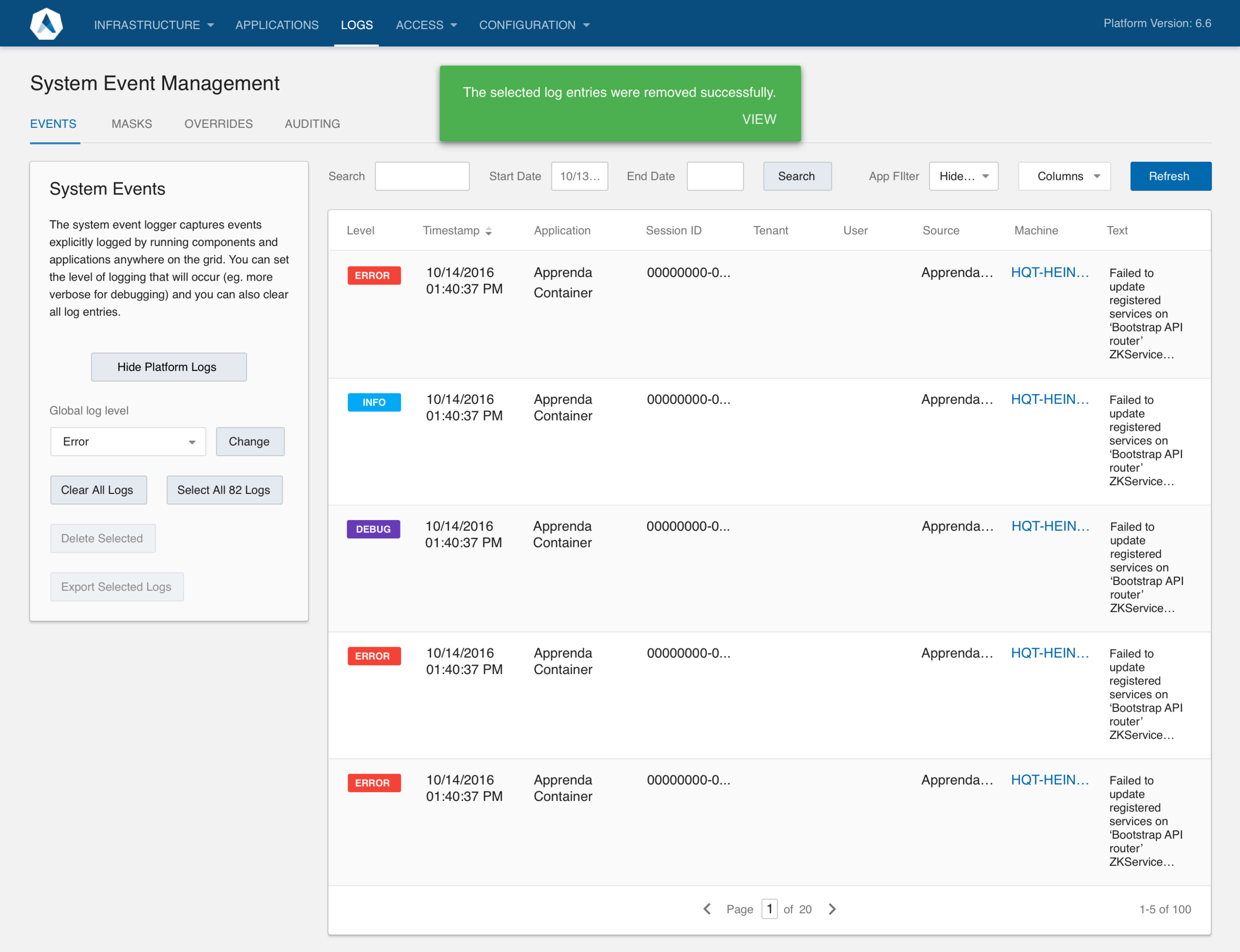
Project 1: Server Health History
This 'history' view solves the problem for operators of not having clear insight into a server's past health – providing them an at-a-glance read on performance.
One of the big features Apprenda introduced in 2016 was infrastructure monitoring summary checks. This enabled IT operators to at-a-glance review a list of server health checks and their results, helping them quickly troubleshoot when issues arose. Our “Systems Operation Center” UI (shown) is just one of a few ways customers can interact with our product, the others being command-line and extensions. This feature capitalizes on a strength of a UI vs. other methods: namely, its ability to visualize data in a clear, orderly manner that’s prioritized for ease of consumption.
Being a lone UX designer means I’ve developed a knack for defending design’s ROI – it’s seldom taken as a given in such a development-driven company – and this project is one I point to in support of design. CEO Sinclair Schuller credited showing this “report card” to operators of their servers’ health – paired with our “Zero Downtime Upgrade” feature – in reducing hours-per-install by 20%.
An operator can drill into an individual report to view its constituent checks and view logs regarding what specifically went wrong.
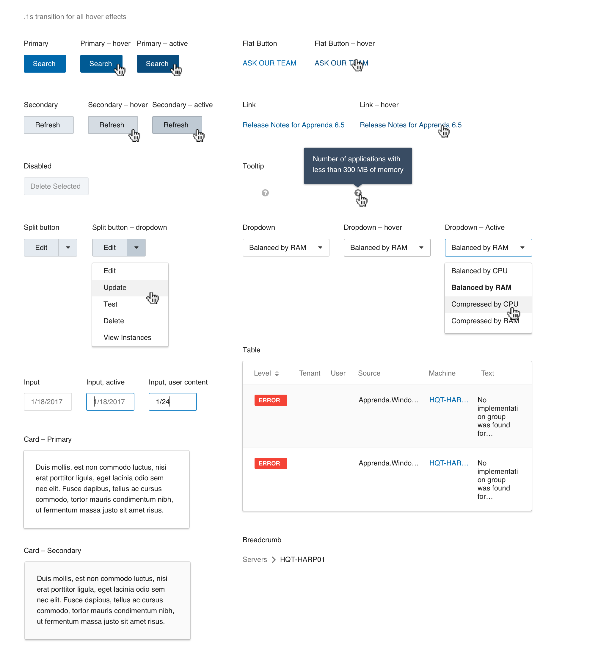
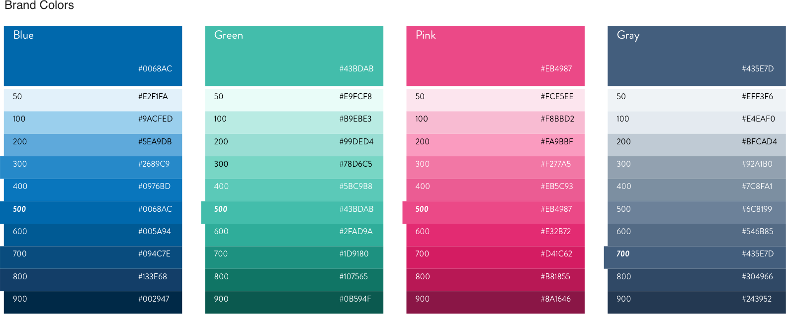
Project 2: Style Guide
Cataloguing unique button styles in just one of our portals 🙈
The challenge: take a visually disparate set of portals and methodically and incrementally move those toward 1) Alignment with each other, 2) A more contemporary look-and-feel, and 3) A more user-centered model – one that factors in key usability concerns such as accessibility.
Project 3: User Research:
Because of Apprenda’s highly technical environment, I haven’t been tempted to “fool” myself into thinking I have an accurate picture of our users; I’ve instead needed to rely on research every step of the way. Research primarily comes through interaction with our client services team, but also involves interviewing users directly and usability testing with tools such as UserTesting.com and Hotjar. I directly engage with a variety of teams internally – developers, client services, sales, product, executives – and that cross-functional work has meant I’ve been able to stay aware of priorities from individuals and at the business level and use those in shaping my priorities.
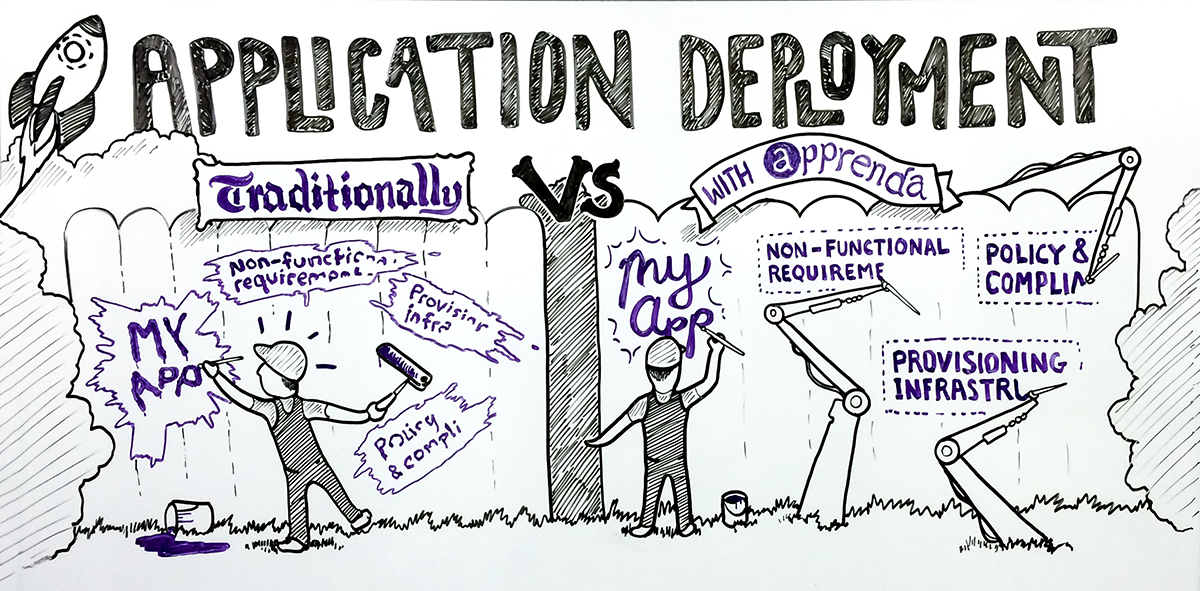
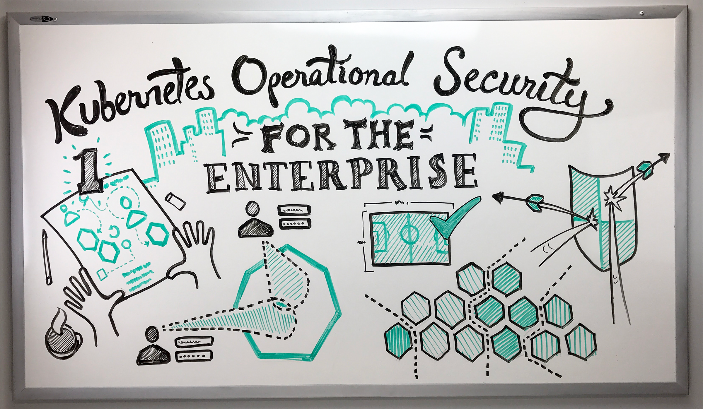
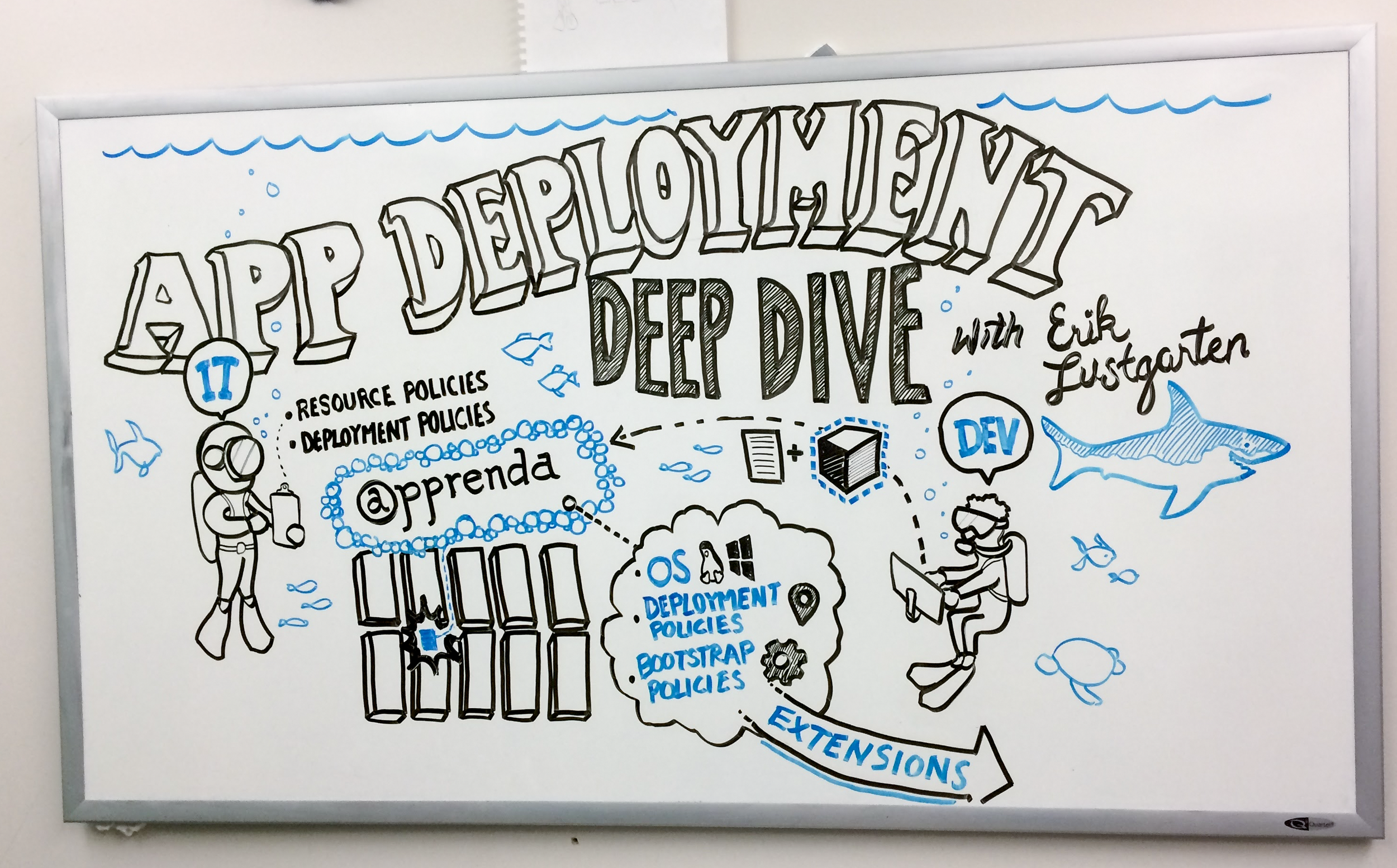
Project 4: Whiteboard Illustrations
Startup life affords me opportunities to be creative outside of my day-to-day duties. One of the areas I've had a lot of fun working on is providing whiteboard illustrations as backdrops for videos explaining various technical aspects of the Apprenda Cloud Platform. I meet with the person giving the talk, interview them about the concepts they're going to cover, then brainstorm with them visualizations for how to simply represent those in a way that would complement their 2-3 minute talk.